Monday, January 08, 2007

Dyeing in the New Year

I needed to dye some more yarn for the meadow, lake and mountains in that window tapestry that I am supposed to be working on. I wanted some yarn that would have a mottled look, combining several colors. In addition, I needed it to have a base of grey yarn instead of my usual cork. To maintain a strict integrity of plane - the yarns used for inside the cabin will be with the cork. The yarns used for the outside - looking out the window - will use the grey yarns. I am hoping this will provide the right amount of depth to the piece and make the view outside the window resemble a water color while the view inside be more reality based.

Since I had extra dye left over from painting the yarn I used it on my lab coat. You see I bought this lab coat to use for dyeing - I never liked wearing aprons. The problem is that I always am so careful about not spilling anything on it. It was so perfectly white. Really what's the point of wearing it if you never spill?


I took care of that...hopefully I can now dye and not worry about spilling on my lab coat.

Tuesday, December 05, 2006

A Tapestry within a Tapestry

Lots of progress here!

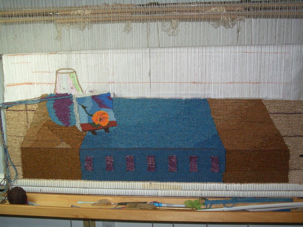
I am so happy I spent that time unweaving the pattern on the blue runner. Now, all in blue, it looks quite simple yet elegant. And the one orange flower in the tapestry [the tapestry within the tapestry] does pop right out. And the shadows really work well.

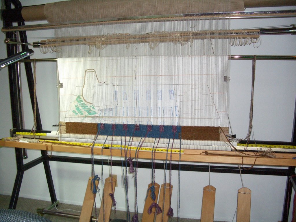
The plan tomorrow is to finish up to the first brown line on the white paper. At that point, I will verify I have a horizontal line with my favorite tool and then document the yarn colors I have used in this first stage.

What I find most interesting about this piece, is that it is best viewed from a far. It looks so much better a bit back than up front. The closer you get the odder it seems. Clearly it has to do with how we set the perspective. It only looks 'correct' from the right distance and height. We did that deliberatively when designing...actually re-designing the piece.

Next - off to the second stage. I will need to make a new cartoon...the challenge here will be to figure out how to make something that is reminiscent of a redwood tree branch without the level of detail I would normally draw to acheive such an appearance. The vase is supposed to have a couple of redwood branches which the painter picked from outside and put into the vase. Also, in the vase will be a bunch of California poppies - the focal point of the piece. If one poppy pops... a bunch should pack quite punch.

I also get to start the window...finally! Can't wait until tomorrow!

Saturday, December 02, 2006

Step Forward?

What a day...about 60 square inches woven...then.... about 45 square inches un-woven...I guess I should be happy...it is a step forward from yesterday.

I decided the pattern for the runner on the table was way too busy and distracting. So much distraction that no one would notice my little flower tapestry inside a tapestry. I will tomorrow replace the distracting now un-woven areas with values of sky blue. I kept telling myself that there was way too much detail for an area outside my focal area and at the bottom of a tapestry...did I listen to that little warning voice in my head...no...no...no...just kept weaving until it was so obvious that it finally hit me in the head. Ah well, it has been fixed...

Tomorrow I will weave some sky blue...with a couple shadows...life will continue.

Tuesday, November 14, 2006

About 5% Done

I have finished the bottom 'hem'. This will go around the canvas and be attached to the back of the canvas. I can now work on the part of the piece that folks will actually look at!

I am getting used to working with the three sets of heddles and corresponding pedals. I had to put some lumber on the floor so my chair would slide back and forth. The chair couldn't slide on the carpet. I am in that section with the alternating blue and lavender stripes which means lots and lots of bundles of yarn. Reminds me of that Navajo weaving class I took a couple of years ago.

Looking at the picture, it looks pretty dark. Given this is the side of the table where there is no light so everything is in the shadows - it should probably be ok. The more interesting part comes in a couple of inches when I get to start working on the top of the table where there are shadows and graduated colors. In addition, there is the golden spiral intersecting the table which needs to be subtly emphasized. Haven't quite figured out what I will be doing there....